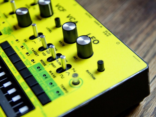
Reader Hani Debbache let us know about these overlays for customizing the Korg Monotribe.
The overlays are silkscreen printed with 3 colors on 10mil Polycarbonate Lexan, with ‘industrial cut-outs’.
The overlays are priced at 19.5$CAD. See the Grouse Design site for details.


Very cool. I hope your considering maybe doing some for the Volcas.
yeah, like this: https://www.youtube.com/watch?v=qvCechdVIYY
Very nice bro.
These look pretty awful in my opinion. Concept is nice, but the type & colors used for them are simply horrid. Florescent green over fluorescent yellow is never a good idea, and that slasher red text on the other, they looks like an 8th grader designed them.
I would really like to see these re-done but with cleaner designs.
I really do like the concept of these, I just feel like they were implemented a bit sloppily.
Agree with the above – very cheap looking designs.
I printed my own on plastic sheet with my printer 😛
I wanted to do the same at a Kinko’s or similiar. How’d the cutting go for you though?
you can make your own at styleflip