Roland has a new Web site, Roland Connect, to introduced its Fall lineup of new gear.
It’s worth checking out, but you may find the new site frustrating, because of some bad Web design decisions.
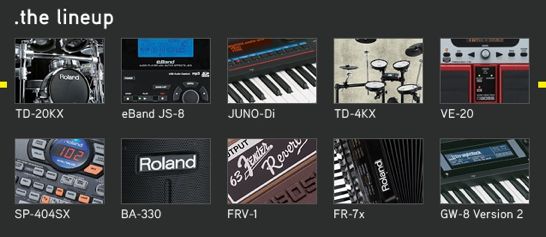
Like the way they present their new lineup:

This is new gear, right?
So, how is someone supposed to know what the heck a BA-330 or a FRV-1 or a VE-20 or a GW-8 Version 2 is?
Are we supposed to just click around and look for something we might like?
The Web site is supposed to sell music gear, not be a game of stump the customer!
If you’re interested in one of Roland’s new products, take a look at the new site. There’s a lot of good info there and multimedia demos, too.
But, please – Roland, Native Instruments and anybody else spending good money on a new website – make your Web designers deliver a site that’s not just sexy, but seductive.

To be fair on them though, the pictures are the real explanation. In fact, they should ditch the text altogether. Better still, wee roll-over samples of the instrument in action would be cool.
Anyway, generic terms can be confusing for some of the new gear. I've got into a lather trying to navigate to some stuff recently e.g. does this thing classify as a 'drum computer' a 'keyboards>synths>modules>rhythm module' or 'studio gear'??
What got me was that the new products weren't arranged in any apparent order. Two new drum sets, but they aren't together… two new effects pedals, but they aren't together… the items don't seem to be in any order at all, just randomly thrown together as "new gear". The Flash video is a complete waste of my time and connection bandwidth, there's absolutely no meaningful content in it but it takes up the majority of screen space.
I won't go so far as to say "bad web design", but certainly poor and uninspired web design, and web design that makes the product for sale — the actual point of the web site — secondary to glitz of the site.
If you take a quick look under the hood, the whole site is SEO'ed to the max. Better than moving Flash menus or lame eyecandy. Kudos to the coder, not so much to the designer. BTW, Synthtopia is not exactly the model of good web design.
Ugly but functional is my motto.
If you have suggestions for the site, though, let me know!
more worse than the design is the lineup
how about some innovation or combining some of their loved analog stuff with new ?
We should have a roundup of all the music manufacturer webdesign revamps that've been coming in lately.
I’ll immediately grasp your rss feed as I can not in finding your e-mail subscription hyperlink or newsletter service. Do you’ve any? Please permit me recognize so that I may just subscribe. Thanks.