It’s still October – but it’s not too early to declare the worst trend of 2009: sexy 3D renderings in ads for virtual instruments.
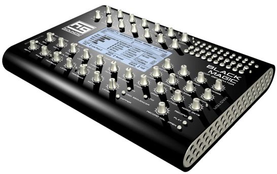
Here are a few of the most annoyingly sexy 3d renderings for virtual instruments that we’ve seen in the last year.
HG Sounds’ Black Magic Loop Generator, above, looks awesomely hands-on.
Look at all those knobs! And the matte black finish – well you know my position on that.
Too bad it’s an “artists” 3D rendering.
And how about this awesomely cool-looking D16 Nithonat vintage-style drum machine:

Give me that thing! Put it in my hands! Take my hard-earned cash!
It’s not really a gorgeous retro-styled drum machine, though – it’s a 3D rendering of a non-existent piece of hardware based on the design of the virtual instrument Nithonat.
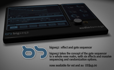
Here’s the new Audio Damage BigSeq2 effect and gate sequencer:

It looks cool enough to make you a little disappointed when you see that it’s “available for vst and au”.
What’s with the giant, poorly lit knob, then?
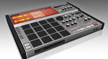
Finally, MOTU really confused people this year with their ads for BPM, their cool new MPC-style drum instrument.

BPM looks like a totally badass piece of hardware – even cooler than the BoomChik.
It’s got:
- 16 MPC-style pads
- knobs galore
- a very nicely placed pair of headphone jacks and
- a generous screen….
Unfortunately – MOTU brought sexy back with the BPM, but it was just virtual sexy.
These companies are by no means the only culprits, and their apps ARE actually pretty drool-worthy.
Next year, though, how about some ads that get us excited about working with software?
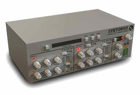
Update: D16 started off 2010 right with some gratuitous 3D and “analog” (virtual digital analog) claims for its new chorus effect, Syntorus:


thank you for including AD in this. surprising he has time for all the rendering between all the ranting…
Oh yes……the good old excitement about some new hardware that looks awesome – but……oh…….it's software. That is truly a bad trend. Although the software may be nice and all, i hate first thinking it's hardware, because for some reason, the fact that it's software lowers the value a bit when you first thought it was a real hands on box.
Ehmm…These are all software companies…Why do you expect that they going to release a hardware unit? When i see these ads, i know from the start that they are going to be software because of the companies.
The best renders are from D16 without second thought…
So how about Arturia Minibrute? do you live in a world where it is going to be just a plugin?
Well MOTU make a lot of hardware.
…are you drunk or something!? =)
Even if they are just renderings(androids), they most definitely shown these companys that there is a demand for these platforms.
When I saw the BPM earlier this year I thought it would give NI Maschine a hard match…until I realized it was only a fantasy in some CEO's bizarre way of thinking.
I think there is room for all these fantastic renderings as the objects the want to be.
Three words: trades descriptions act.
PS. I shall be selling the world's first virtual computer next year. It costs only $250, but you'll need a PC or Mac to run it on. It will emulate perfectly the PC or Mac you run it on. There will not be a Linux version.
Yes. I'm virtually Little Boots so pay me real money and you can virtually listen to my music!! =D
I had an argument a couple of years ago with a guy while we were looking at this building in Berlin. I'll spare you the architectural details but the gist was that, since we all knew a lintol no longer actually supported the rest of the building above and as we all knew that the bricks were mere cladding to a concrete or steel structure, it was OK that the entire thing merely looked like a brick building that wouldn't stand up, because actually it was a concrete building that evidently did stand up with brick cladding or maybe brick-pattern fibreglass sheet cladding… see where I'm going with this?
All this virtuality stuff forces us to question what really matters.
Well, without getting all philosophical or struggling with architecture metaphors…
No, I don't like this trend to create virtual 3d renderings of things that will never exist in real 3d, with the intent of tricking my interest into actually wasting my time looking at a product I would otherwise never look twice at. It's not that I have anything against software… ok, maybe it is. I like hardware. I get excited by hardware design, because it's a balancing act between the ultimate knob laden goodness and the practicalities of physical space. I like things I can touch and fiddle with, which would be why I have a real cat and not a virtual 3d rendering of a cat.
Is this perhaps some grudging admission from software makers that, really, hardware still has some areas of superiority to virtual products? That something we can touch will always have more "value" than something that we can't?
Next up – flying buttresses on soft synths!
Sorry, can't resist… they (the advertisers) know people *think* they want a physical object for their money. That's been the basic trick of advertising for long enough. What they're selling, say, is a rather vile-tasting drink that gives you a headache. But what you, the consumer, really buys into is the idea of the sunset on the tropical beach and the beautiful significant other… all that emotional and visual fulfillment and pleasure awaits! So – and people do tend to fall for it – you go purchase the vile-tasting drink in the supermarket. And get a headache. Result! (for the salesperson).
Therefore that's what the advertisement does with the virtual real groove-box. And why is a physical thing like this more desirable than software? Well, ever seen Jimi Hendrix pose with an iMac on stage or… anyone? The dream of the musician is of someone playing a physical instrument on stage to an adoring audience, not someone sitting on their own in front of a computer. That image takes the dream one step too far away to be desirable enough to spend much money on.
So much for advertising (and apologies for the digression). Put advertising techniques to one side and we have brilliant sounds coming from both software and hardware. Like most people who hang around here, I have both. And, like you, I know for a fact that a Moog Voyager does things a Moog software emulation doesn't. In theory the latter can but in reality it doesn't. And it's not something that's easy to quantify. Sure, there are easy things to quantify like knobs you can actually twist with one hand whilst playing keys with the other. But it's the whole package that plays the sorts of subtle differences with one's perceptions and performance responses that work in the equally subtle territory of musicality.
With all this going on, there's a surface-trading in technical specs competing against one another but also a whole set of competing, complex mythologies and experiences going on underneath.
I, too, am looking forward for when this ostentatious trend goes out of fashion.
Point well made.
Hmmm… but are you the real Gordon? I mean, I can see your photograph, but…
New Rule: No flying buttresses on virtual synths!
I fully get the whole tenets-of-advertising thing (though your example is a far better illustration than I could think of at the time). While I haven't purchased any headache inducing vile drinks, I have certainly fallen pray to their other tricks often enough. It is the nature of advertising to make unappealing products look interesting, and mediocre products seem life-changing.
Perhaps what I'm really reacting to is the insistence of software developers on making their controls look like physical counterparts when the virtual nature of the software (and the physical movement of the mouse) makes all sorts of other control apparatus possible. Synplant makes for a good example of a virtual instrument that has very few knobby controls at all, because knobby controls don't fit the interface metaphor being used.
Yeah, that's probably it… I'm just tired of not-knobs pretending to be knobs (euphemistic chuckle optional)
aL, I totally agree with the fake interface where a genuinely amazing interface could be on a computer. I’m used to such discussions in architecture which is why I yabber on so on threads like this – about visual pastiche. It’s an ancient thing, though: cave mouths masquerading as temple fronts, with temples themselves as stone versions of timber huts, all the way up to early railway carriages in the guise of multiple horse-drawn carriages all linked together.
These all are the strands of continuum or the obstacles to progress and accurate visual mapping (direct image rather than metaphor, as you say) depending on how one looks at it.
But take the Mini Moog. There’s an object that uses a note input device based on that of the piano (which was a compromise, I know) but it’s hallmark – this flip-up panel of knobs – has entered our consciousness as ‘what a synthesizer looks like’ not because it looks like a piano superimposed upon something else but because the arrangement of controls follows the arrangement of the signal path. The clarity and effort of thinking required both for conceptualising such a thing as a ‘signal path’ and the controls laid out to follow this underlying wonder… well, to my mind that’s what makes the visuals of a proper instrument. I guess a computer screen has to do so many different things its interface is always going to be more illustrative than actual. I’ll check out this Synplant because it sounds like it might be making more intelligent use of this idea…
I understand wanting to solidify the concept that "This is an instrument" by using a familiar physical bridge. But since a software synth or effect doesn't include those tactile controls, this is often tantamount to DECEPTIVE MARKETING. It's obvious to someone well-versed in the difference between an AU and a VST, but for newcomers, it's very confusing. I'm no fan of pointless disclaimers for dummies, but beyond the creative slant, there should be more clear call-out that "Hey, this is code! There's no knob box to go along with it."
The MOTU BPM example is ESPECIALLY bad because it has the gall to show an MPC-style disc tray underneath, and headphone output. Bleh.
Reminds me of the video game advertising ploy – "Not actual game footage." Or, my favourite one from various on-line shopping sites – "Picture is for illustration purposes only."
‘Artists representation of a virtual instrument”
on doit bien s’amuser avec cette table
Audio software has become just like burger ads, prettier than the real thing.