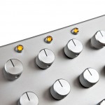
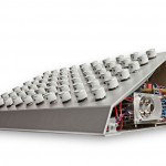
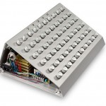
At Musikmesse 2011, Elektrokosmos, a boutique Swiss manufacture, announced a new analog synth – the Kosmonaut.
The Kosmonaut synthesizer features 2 VCO’s, 2 VCF’s, 2 envelope generators & 2 VCA’s.
Other features:
- RMO, Ring modulator, EXT in + VCO
- Mixer, VCA1 + VCA2 + RMO
- Potentiometer 46
- Rotary Switch 14
- Midi Learn Button, Rev. Note/0V + Midi Controller Setup
- 1 Midi IN, 2 Line IN, 1 Stereo IN CV/GATE, 1 Line Mono OUT
- 5 x LED, Power, LFO 1+2, ENV 1+2
- Power Supply, 100V – 240V AC / 35W
- L x B x H, 440 mm x 310 mm x 170 mm
- Weight 6,8 kg
- Fully Handmade
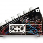
- No Mechanical Connection inside
Elektrokosmos has this to say about their philosphy:
We update the principles of the last century with today’s technology and optimize them for high expectations. Every component is diligently selected and assembled by hand – every synth is unique. Elektrokosmos stands for robust machines and convincing sound. The user-friendly layout guarantees an exceptional playing experience.
Audio demos are available at the Elektrokosmos site.
Pricing is TBA.


Great front panel labelling!
Looks an absolute beauty. Labels left off untill they finalise design no doubt. Couldn’t see the demos on there site though but it does explain the layout slightly.
Nice hat
They've got a animation on their site that shows what all the knobs are for. I'm assuming they're going to get real front panels???
Mono or poly?
b e a u t i f u l ! ! !! !!!!
Looks expensive…
lol… i agree… looks like a half-finished perfourmer
http://www.elektrokosmos.ch/tech_data/
here you go…
http://www.elektrokosmos.ch/tech_data/
here you go…
http://www.elektrokosmos.ch/tech_data/
here you go…
http://www.elektrokosmos.ch/tech_data/
here you go…
http://www.elektrokosmos.ch/tech_data/
here you go…
http://www.elektrokosmos.ch/tech_data/
here you go…
Does is come with a sharpie marker?
The clear side panels are cool… they ought to throw a few extra LEDs inside just for the hell of it for some internal blinky fun!
the man with the hat or the synth?
as for the synth: i'm more interested in the sound
biggest relief is that it isn't running on a touch screen
finished product or no? Lack of labels or screen of any kind could be a major turn off no matter how good it sounds
personally – this looks difficult to navigate… even with labels – ESPECIALLY onstage. I need more feedback from the layout and graphics… please. If the knobs were somehow color-coded (anodized) aluminum, that might be a start. design is supposed to make an interface easier to understand… not more confusing or nebulous… unless the intention is to make totally random sounds…?