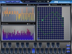
Pioneering synth designer Wolfgang Palm has released an update to PPG WaveGenerator, a software synthesizer for iPad that builds on the heritage of the PPG Wave keyboard.
Here’s what’s new in PPG Wavegenerator 2.0:
- Virtual and Hard MIDI Output
- MIDI Poly Pressure
- Touch Keyboard Extensions
- Minor improvements and fixes
Key Features:
- Creation of your own waves and wavetables.
- Playful sound creation simply by drawing or picking harmonics
- 3D page, visualization of the wavetables, transformation from photos into wavetables.
- 256 waves assembled within a wave grid
- 3 Audio Oscillators
- 3 Noise generators, for audio and modulations
- Classic 24 dB Lowpass Filter, combined with an overdrive simulation.
- Dual amplifier, for versatile control of 2 audio signals as well as panning.
- 13 Envelopes, for independent control of pitch, waveform, filter and noise gain and panning
- 4 LFOs
- Arpeggiator
- Delay/Reverb effect
- Audio engine with 2 synthesis modes, and variable wave blending quality.
- Directly accessible context help inside the app
- Use a camera, to shoot a picture and then transform it into a sound!
- Using state of the art technologies, but still the versatile and efficient synthesis system.
- Build your own keyboard, with the keys you prefer for your music.
- Audio recorder, up to 10 min. at 44.1 stereo
- Audio Copy to the pasteboard
- File Sharing via iTunes
PPG Wavegenerator 2.0 is available in the App Store for US $19.99.
If you’ve used Wavegenerator, let us know what you think of it!

Truly innovative synth. Thanks mr. Wolfgang Palm for such an excellent product.
Cool, PPG Wave v2.0! Sounds exciting. But what’s new? I can’t see anything? Midi, really?
MIDI Poly Pressure is really a big thing. most virtual instruments don’t even accept it yet, and most midi controllers don’t even output it. But a $20 ipad app does?!?! Thats pretty awesome!!
Is the blue background necessary behind the extended keys? I’m not sure i like that. It looks like the prototype step before the finished version. In wavemapper it is just the key outlines without a transparent background rectangle. This looks much better no? It’s also hard to see the extended key outlines as is. I would get rid of the blue bkgd and make the outlines darker? And then maybe make the upper panels scrollable like in ims-20.
Still an improvement though.