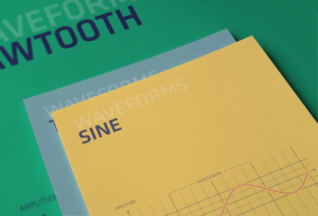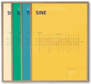
Third Wave Graphics has introduced Waveforms – a series of posters that elegantly document the basic elements of classic synthesis.
 There are four posters in the Waveforms series. Each poster features one of the basic waveforms: Sine, Triangle, Square and Sawtooth.
The minimal posters graphically show the shape of the wave and its underlying mathematics, and also provide a short ‘definition’ of the wave.
Each poster is printed on heavy-duty 200g silk finish, FSC certified and climate compensated paper. The posters measures 50cm x 70cm (about 20″ x 28″).
The posters are available from Third Wave Graphics individually for US $35 or as a bundle for $100. Third Wave Graphic has also made the designs available as free wallpapers for your computers and iOS devices, in multiple resolutions.
Update: Third Wave Graphics is giving free shipping to Synthtopia readers, if you use the discount code ‘synthtopia’ at checkout.

We have these at my work, they’re simply stunning! The colours pop so well, it’s an amazing print. I also happily cycle them on my desktop, hehe. I just wish they’d do some more, with things like phases, dithering, spectral stuff, that kind of thing.
OK, so what’s the deal?
Looking long enough at a poster will tell you all you need to know about sound design and synthesis?
I can imagine these posters have their use in some contexts, such as secondary school, but they only show some trivial mathematical periodic functions.
What is their use for serious sound artists as well as newbee synthesists? Nothing about phase, frequency or amplitude modulation, nothing about instability / randomness. Not even a hint of the spectral content of each of these wave forms …
I don’t know, maybe, uhm, to have some nice shit to put on your walls ? Think of it like a movie poster.
I like the idea that someone is creating wall art specifically for synth freaks like me!
Yes — great point! As a serious musician and advanced composer with an extensive collection of genuine analogue equipment (reply with your email if you would like specs and serial numbers), I fail to see how this has any interest or value whatsoever. Also, I am so alone.
They look a bit boring to me to be honest. Maybe i’m spending too much time with the oscilloscope..
This is plain stuff. They should of at least put divisions of ?. Like ?/6, ?/4, etc..
Thanks for the wallpapers! I will shuffle them in with other art and music images.
It’s meant for the general non synthesist type. If you can sell to the bourgeois then you can make some money. Life.
I like them for what they are: posters. I don’t understand the critics for not being an acoustics book to consult when you need remember that particular notion you can’t remember off the top of your head. Hey… they are what they are: simple and stylish posters to hang on the wall.
Having said that, I would rather buy something like this if only it would be more stylish….
http://www.independentrecording.net/irn/resources/freqchart/main_display.htm
That site has very informative material but it’s a pain to the eyes. If they had Third Wave Graphics style and quality I would buy them straight away (posters or otherwise).
Lissajous patterns would be even neater
Great wall art for the studio! 🙂
$35 per poster for these??? Some people have more money than sense.
And you have more time than money 😉
haters = tw@ts
leave it to synthtopia readers to get upset about posters.