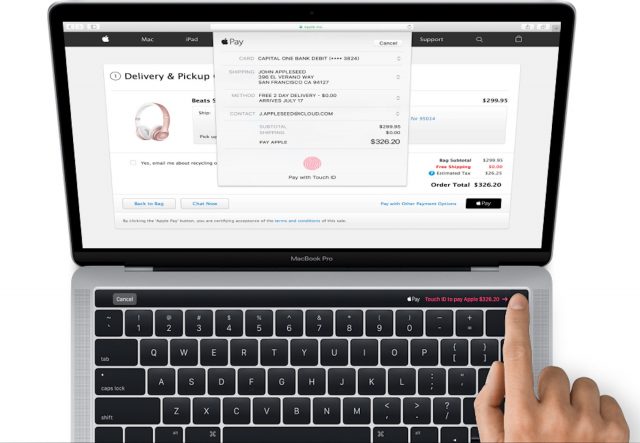
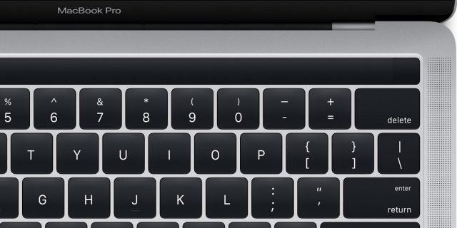
It looks like the MacBook Pro is going to be losing its function keys – and gaining a touchscreen ‘Touch Bar’.
With the release of the latest MacOS Sierra update, images have leaked out that appear to confirm rumors about the new MacBook Pro – expected to be introduced this Thursday. The images, found in in System/Library/PrivateFrameworks directory of macOS Sierra 10.12.1, show an touchscreen strip running across the top of the computer keyboard.
The Touch Bar appears to be Apple’s approach to bringing dynamic touchscreen functionality to laptops. The Touch Bar will dynamically display buttons and graphics that are relevant to the task that you are doing.
Given the popularity of OS X with musicians, we expect that developers to take advantage of the new capability.
This means that your active music app could display its toolbar at the top of your keyboard, instead of forcing you to remember which function key or keyboard shortcut to use. For example, your DAW could display transport controls and then change to editing tools when you select a track.
Apple has previously criticized Microsoft’s approach to incorporating touchscreens into laptops, which has been to adapt Windows to support hybrid tablet/laptop devices. CEO Tim Cook compared this approach to converging a toaster and a refrigerator – suggesting that it results in a weird hybrid. So far, the market appears to be supporting Apple’s take on this. Microsoft’s Surface Pro devices have only found a niche audience, though many users love having the capabilities of a desktop OS on their tablet.
Apple has not made any official announcement about the new MacBook Pro yet, but they have a keynote event scheduled for Thursday, 10/27.


Hmmm. Weird idea.
If they would add this ribbon to a normal keyboard too and it would be possible to take advantage of what it is showing, then a ribbon controller wouldn’t be such a bad idea.
I also heard they may be dropping the USB ports. They probably want everything thunderbolt. I have so many Thunderbolt adapters now its ridiculous but probably not that big a deal if you got money. If not, then your SOL.
They will be dropping the old style ‘turn it over three times before you insert it the right way’ USB ports and adopting USB-C ports, which CAN support both USB 3 and Thunderbolt 3, although it is likely that if the new MBP has 4 USB-C ports then maybe only two will support Thunderbolt. Frankly, I think this is a truly ‘courageous’ decision, rather than dropping the headphone port off the iPhone 7…
If the rumors of the demise of the ESC key are true on the new MBPs then it’s a dastardly plot I say! against us vi users (although of course we can still resort to CTRL-[ – you don’t get rid of us *that* easily Apple !!! Ohhhhh no!
  )
)
esc is too far a reach already! rebind caps lock to esc
Caps lock to CTRL (via OS X settings, for all apps). jj to escape via vimrc. no movement. Unless your name is jj and you sign a lot of stuff in vim.
Or you could always switch to emacs….
if they want to get rid of somethging
HOW ABOUT THE MUTE SWITCH
anyone who has been annoyed by it knows why
No USB? No esc? No function keys? I must be getting old. I guess I’m stuck with used computers from now on.
they are called tablets
thunderbolt 3 was designed to use the same form factor as usb-c ports… also can handle data transfer from usb3 and more. honestly taking this step makes sense, though i do wish they’d handle it softer by keeping at lease one usb-a port onboard. all or nothing will have a lot of backlash.
more importantly…. why in the hell would they replace magsafe with a usb-c port for power? i get it, single port… but man, that magnet is so convenient. it’s a damn shame if this rumor is true.
I’m also upset about the lack of escape key… it could be dealt with in terminal & iterm… but the physical buttons are so much easier for coders. honestly the arrow keys were kind of a deal breaker for me to code on the 12″ macbook, used it for several months, and positioning was just awful. productivity went way down, until i went back to a 13″ with the previous keyboard layout. it’s fantastic as is, honestly wish they’d just keep it as is. the touch screen idea is nice, but put it on the physical keys, and don’t try to convert my macbook into an ipad.
Finally a modulation ribbon in laptop.
Next coming up, keyboard with an aftertouch.
that would be great for p,,,
opps my bad we are talking about music
The trackpad does have ‘aftertouch’ already.
Lenovo tried this years ago on the X1 Carbon. Didn’t work well.
Without escape and function keys, I wonder what Renoise will do? A magic toolbar software adaption just for that model of computer? Would that have an impact on Linux and Windows editions? It would ruin Redux I think… would it impact other plugins? A bit worried about audio app developer uptake of the keyboard adaptions in the large… caution… unless Apple provide a ‘default mode’ that just presents the traditional keys. Any knowledge on the API for this?
external keyboard.
Apple is know for many ridiculous moves (the last being removing the headphone jack), but this is just sick. Anyone ever counted how many times the ESC key is used per day?
Someone at Apple has too much time on their hands.
The keyboard can be remapped so you can assign escape to any other key.
So you lose another key.
why not abandon the space key altogether and replace it with a phonetic command. Every time you need to ‘space’ something you just shout pauseeeeee (or something weird and awkward just because…). Apple seems to me like a headless chicken after Jobs ‘left’ and badmouthing touchscreens while trying to introduce part of it’s technology from the back door and for ridiculous reasons is a sign of lack of vision..Microsoft at least came with an idea bad or good it doesn’t really matter an idea with a beginning a middle and an end.
Why have a keyboard at all? Just bolt 2 ipads together with a hinge. Job done.
That ribbon doesn’t bring touch screen functionality to anything.
A touch screen does.
I REALLY hope this isn’t all it has in its sleeves.
I was waiting for Apple to give a professional touchscreen device, but it seems the Surface really is the only way.
Surface pro 5 beckoning…
If I can assign a row of shortcut buttons to that ribbon for all my UI heavy applications (photoshop, lightroom, FL Studio, …) then this is a dream come true.
You can do that right now with the F keys or any keyboard combo. Settings>keyboard>shortcuts.
that interface still looks better than new synthopia web design
I’m getting a RAZER laptop because DEADMAU5 uses one. Goodbye Apple !!!
I hate Apple. Happily Apple free.
I’m a long time apple user and, unfortunately, I think they’re just a “phone” manufacturer at this point. Instead of making computers and operating systems and porting them down to hand held devices, it seems like they’re making hand held devices and porting up the same ideas and technology up to their computers. It’s great if you’re 20 and only use computers for looking at porn and playing candy crush. It’s terrible if you’re an older and used to computers that are reliable and made to do actual work.
I have been a graphic designer for 20 years. And as a graphic designer, we use the control keys constantly. I mean constantly! The muscle memory after years of using dozens of different control key combos is an asset to our productivity. Like a well trained athelete, we don’t even have to think about or look at the control key combo we are using.
This new touch ribbon will be a major stumbling block for professional users such as me. In fact, my Wacom pen tablet has programmable buttons that are intended to substitute for the control keys of a keyboard, and after several attempts at using them I ended up disabling them for the reasons I’ve already stated. Plus, the damn touch ribbon is at the top of the keyboard, which means more reaching, more accidental key strokes, and haveing an arm covering the keyboard (the keyboard is often needed for certain key combos). There are way too many key combos to fit on that touch ribbon, which will mean having to scroll through a menu of items to get the one you need. What the hell are they thinking? The design industry has always been at the core of Apple’s user base.
This new design will leave longtime users like me at a loss. Fuck you very much (yet again) Apple.
I’m with you in the muscle memory thing. i have a feeling that research bore out what I’ve long noticed while painstakingly watching others using computers: we are in a very small minority of users.
press “any key”
ok where the hell is the “any key”
doh
First the shite-awful, amateurish ‘flat design’ (“Ewwww!! Skeumorphism (betcha don’t know what that means, peasant!) is sooooooooo icky and 2008, let’s bring back 1986!) then the watch that nobody wants or needs, then they remove the audio inputs on the MB/P, THEN the headphone jack, now this…to whom do we owe our thanks? Is it another brainchild of Johnny IveGotavendettaagainsteverythingthatSteveJobsstoodforandmadeApplegreat?
Apple has lost it’s way…go over to the Apple Insider site and see how their participants view things…all about the stock with a logic like,”the creative user segment is too small to be consequential to the overall picture of profit…so, basically, fuck ’em”
…it is all about the smartwatches, apple car, beats music ecosystem, and that campus 2…not to mention that everything apple does is sound and not to be questioned
Great for idiots. Nightmare for anyone who’s used an apple computer to do any pro app media work over the last 10 years
This sucks
Presumably those of us who prefer it can set the thing up to look like esc and F1, F2, … F12 keys and leave it that way (leaving it is crucial for accessibility and they’re quite good at that). If so, seems pretty cool to me.
https://9to5mac.com/2016/10/31/macbook-pro-diary-opinion-criticisms/?pushup=1
This article addresses many of the criticisms against the new MacBook Pro w TouchBar.